Basic Android UI performance
The base of every good app is performance. No user is willing to use an app with subpar performance, especially not with the amount of apps on the Play Store and thereby possible alternatives. In this post, we will take a look at some of the basics of Android UI performance and some of the pitfalls.
Layout Hierarchies
All Android UI are based on XML files describing the desired design. Developers are easily carried away by nesting several instances of different elements like <LinearLayout> or <RelativeLayout> to solve a layout puzzle. This can be a potential performance problem, since each elements require initialization, layout and drawing. We are talking milliseconds here, but with several layouts on-screen using, for example a <ListView>, these milliseconds get multiplied and noticeable delay could occur.
The golden rule when constructing Android layouts is to make the layout shallow and wide rather than narrow and deep. This can often be achieved by using <RelativeLayout>. A good indication of bad layout design is when nested <LinearLayout> is used. This often calls for a different approach to solving the design problem.
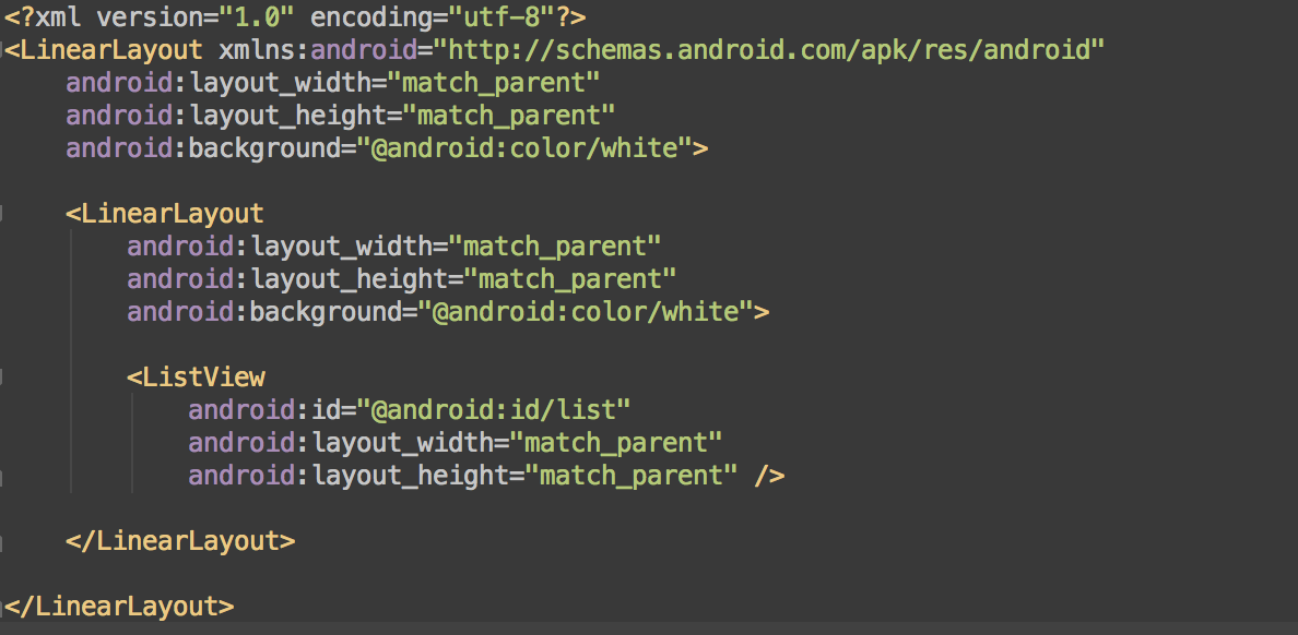
Below is a very simple example of layout nesting. The two <LinearLayout> are redundant and can easily be removed.


The Android SDK ships with a tool to help you with tracking down these layout issues. In the “<sdk>/tools/ folder” locate hierarchyviewer. This tool will give you a visual representation of the view hierarchy as a tree graph. More importantly, it makes it possible to inspect each individual view element and get metrics about the measure, layout, and draw times of the rendering. Color coding for each metric makes it easy to identify the slowest parts of your view. By finding the nodes with red and yellow performance indicators, you can identify the problems you should address first.
For more information of the Hierarchy Viewer, visit the Google developer page here
Overdraw
One of the metrics mentioned as part of the layout performance in the previous sections is drawing. Drawing performance issues can have many causes, but a common one is overdraw. Overdraw happens in all apps, but the important part is to keep it at a minimum. At its core, overdraw simply denotes the concept of the system drawing something on the screen on top of something else. If a blue rectangle is placed on a white background, the rectangle would create overdraw.
The easiest way to test an app for overdraw problem is to enable “Show GPU overdraw” in the Developer Settings of the phone or emulator. This will color the entire screen based on the amount of overdraw.


Simply put, red is bad, blue and green is good. No color at all implies no overdraw – the pixels were only painted a single time. Blue means 1x overdraw and green means 2x overdraw. Light and dark red means 3x overdraw and 4x overdraw, respectively. All red areas should be optimized. Minor light read areas are acceptable, but larger areas of red and even green should be examined further.
A common cause for overdraw is often the use of several full-screen backgrounds. If the view have several layers of overdraw even before the content is drawn, overdraw is inevitable. It is easy to fix this by simply removing the extraneous layers – again optimizing the layout hierarchies.
Lint
Android Lint is a great tool which scans the project for bugs and performance issues. Lint will find much more than just UI issues but focusing on the UI related findings it will help developers with common errors in the XML structure. It will recommend the use of compound drawables where possible and recommend removal or merge of layouts if possible to reduce nesting.

Running an Android Lint scan is simple and is a great source of potential performance gains. The tool is constantly under development and new checks are added. Another good reason to run a new scan regularly.
Conclusion
These simple UI performance hints are just scratching the surface of good practice when creating Android apps. One common pitfall when developing for the mobile devices: Remember the limited resources. An Android app does not have the same amount of resources as a server application even if they are both written in Java. While this post has been focusing on Android UI, several other aspects affect the performance of an app. These are out of scope of this post, but have a look at Google’s own performance page for further details.
A couple of general points regarding Android app performance:
- Do not complicate layouts unnecessary. Reduce nesting.
- Do not just initiate new objects for sport.
- Do not make IO operations on the main thread. Move everything with any kind of delay into a separate thread.
- Do use ProGuard as part of your release build to optimize the app.
- Do give the user feedback on everything e.g. clicks and long running processes.
- Do run code inspection regularly and do not just ignore Lint warnings.
- Do test your apps for responsiveness. If something is bothering you, it will for sure be bothering your users.