AngularJS directives for C3.js chart library

For one of our projects we wanted to create some nice charts. Feels like something you often want but do not do because it takes to much time. This time we really needed it. I had prior experience with Highcharts, which is also a nice library. But this time we wanted more control. We had a look at D3.js library, a very nice library but so many options and a lot to do yourself. Than we found c3.js, check the blog post by Roberto: Creating charts with C3.js. Since I do a lot with AngularJS, I wanted to integrate these c3.js charts with AngularJS. I wrote another blogpost on that: Using C3js with AngularJS. Through twitter Abdullah Diaa mentioned that it would be great to have directives for these charts. That is were we start in this blogpost. I am going to describe the first version of a directive I have created to make it even easier to create these chart using AngularJS.
Using the directive
The goal for the Angularjs directive is to come up with some sort of DSL in the HTML language for creating charts with c3.js. I will go though the different aspects of creating a chart.
You do not need a webserver to run the samples, the easiest way is to clone the repository from github or download the zip.
The html page
When using a directive, you need to load some javascript libraries on your html page. We need the d3.js, c3.js and the angularjs libraries. Of course we need the directive javascript file and we need to initialise our AngularJS application. The following code block shows this code as well as the most basic chart.
<br> <!doctype html><br> <html ng-app="graphApp"><br> <head><br> <meta charset="utf-8"></p> <p> <link href="css/c3-0.2.4.css" rel="stylesheet" type="text/css"><br> </head><br> <body ng-controller="GraphCtrl" ><br> <c3chart bindto-id="chart1"><br> <chart-column column-id="data-1"<br> column-values="30,200,100,400,150,250"<br> column-type="line"/><br> </c3chart><br> <!-- Load the javascript libraries --><br> <script src="js/d3/d3-3.4.11.min.js" charset="utf-8"></script><br> <script src="js/c3/c3-0.2.4.min.js"></script><br> <script src="js/angular/angular-1.2.21.min.js"></script><br> <script src="js/c3js-directive.js"></script><br> <script src="js/graph-app-directive-1.js"></script><br> </body><br> </html><br>
Most basic chart with static data, notice initialising app with ng-app and the controller with ng-controller. Also checkout the c3js-directive.js file if you want to learn about the directive.
<br>
var graphApp = angular.module('graphApp', ['gridshore.c3js.chart']);<br>
graphApp.controller('GraphCtrl', function ($scope) {<br>
});<br>
A very basic AngularJS application that loads the directive gridshore.c3js.chart and does nothing else.
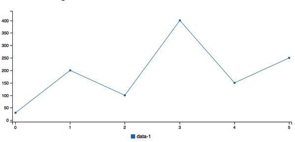
The main element is c3chart, with the attribute bindto-id we define the id of the html element the c3js chart is bound to. This makes it possible to add multiple charts to one page. In this sample we provide the data using a predifined set of numbers. This is done by the chart-column element. In this element we can define the id of the line, which is used in the tooltip and the legenda. Also you can change the type of the column by changing the column-type, change it to spline for instance. Below is the chart created with this code.
Use AngularJS to provide the datapoints
Another way of providing data is using a more angular approach. Now we provide the data using the $scope of the controller.
<br> <c3chart bindto-id="chart" chart-data="datapoints" chart-columns="datacolumns"><br> </c3chart><br>
<br>
graphApp.controller('GraphCtrl', function ($scope) {<br>
    $scope.datapoints=[{"x":10,"top-1":10,"top-2":15},<br>
                       {"x":20,"top-1":100,"top-2":35},<br>
                       {"x":30,"top-1":15,"top-2":75},<br>
                       {"x":40,"top-1":50,"top-2":45}];<br>
    $scope.datacolumns=[{"id":"top-1","type":"line"},<br>
                        {"id":"top-2","type":"spline"}];<br>
    $scope.datax={"id":"x"};<br>
});<br>
Notice that we put three objects in the $scope, two of which we also have in the html directive (datapoints and datacolumns). This time we have 2 lines: top-1 and top-2. As you can see we can configure the type again, this time I configured two different types, line and spline.
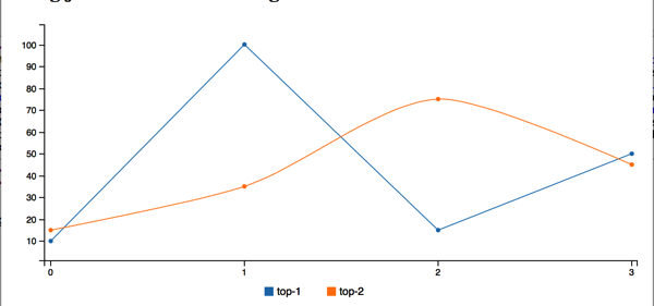
If you look closely at the datapoints, you can see we have an additional property called x as well as a different object on the $scope called datax. We can add an attribute to the directive called chart-x that tells c3js to use the values from x as values on the x axis. We can also change the name top-1 to a nicer version and we can change the colors of the lines if we want to. The following code shows the changes.
<br> <c3chart bindto-id="chart" chart-data="datapoints" chart-columns="datacolumns" chart-x="datax"><br> </c3chart><br>
<br>
graphApp.controller('GraphCtrl', function ($scope) {<br>
    $scope.datapoints=[{"x":10,"top-1":10,"top-2":15},<br>
                       {"x":20,"top-1":100,"top-2":35},<br>
                       {"x":30,"top-1":15,"top-2":75},<br>
                       {"x":40,"top-1":50,"top-2":45}];<br>
    $scope.datacolumns=[{"id":"top-1","type":"line","name":"Top one","color":"green"},<br>
                        {"id":"top-2","type":"spline","name":"Top two","color":"blue"}];<br>
    $scope.datax={"id":"x"};<br>
});<br>
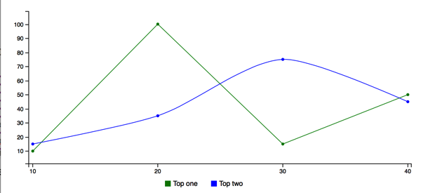
Notice that the colours of the lines changed as well as the names in the legenda.
Now the data is coming from an AngularJS model object. We can use AngularJS features to obtain the data from a service for instance, or we can even do something with an update of the data using $interval. The directive listens for changes to the datapoints model, it does not change when datacolumns or datax changes. If the datapoints changes, the graph is redrawn. This is what we are going to use in the next bit.
A time based horizontal axis.
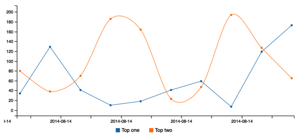
In this sample we are going to show you the timeseries chart, as available from c3.js. To do this, you need to add information about the x-axis. We need to tell it to be of type timeseries and we define the format of the tick (meaning the values on the x-axis). The following code block shows the html.
<br>
<c3chart bindto-id="chart" chart-data="datapoints" chart-columns="datacolumns" chart-x="datax"><br>
<chart-axis><br>
<chart-axis-x axis-id="x" axis-type="timeseries"><br>
<chart-axis-x-tick tick-format="%Y-%m-%d"/><br>
</chart-axis-x><br>
</chart-axis><br>
</c3chart><br>
Notice the attribute axis-type
Next the trick to update the data in the chart. What we do is change the model parameter in the $scope called datapoints. Than in the directive we watch the datapoints collection and redraw the chart if changes.
<br>
var graphApp = angular.module('graphApp', ['gridshore.c3js.chart','graphApp.services']);</p>
<p>graphApp.controller('GraphCtrl', function ($scope, $interval,dataService) {<br>
    $scope.datapoints=[];<br>
    $scope.datacolumns=[{"id":"top-1","type":"line","name":"Top one","color":"black"},<br>
                        {"id":"top-2","type":"spline","name":"Top two"}];<br>
    $scope.datax={"id":"x"};</p>
<p>    $interval(function(){<br>
        dataService.loadData(function(data){<br>
            $scope.datapoints.push(data);<br>
        });<br>
    },1000,10);<br>
});</p>
<p>var services = angular.module('graphApp.services', []);<br>
services.factory('dataService', function() {<br>
    function DataService() {<br>
        var maxNumber = 200;</p>
<p>        this.loadData = function(callback) {<br>
            callback({"x":new Date(),"top-1":randomNumber(),"top-2":randomNumber()});<br>
        };</p>
<p>        function randomNumber() {<br>
            return Math.floor((Math.random() * maxNumber) + 1);<br>
        }<br>
    }<br>
    return new DataService();<br>
});<br>
Notice how we use $interval to load a new datapoint using the service every second 10 times. Check the object that the service returns with three properties: x, top-1 and top-2
The dataService is used to generate a new object with three properties, the current datetime for the x axis and two random values for the different lines. Notice the $interval which helps us to wait one second before creating a new point. It will do this 10 times. The most important part here is that you do not need to change the directive to make the data dynamic. This is purely done in the controller for the page you are on.
Next up are more features made available by the very nice c3.js library.
Some extra features provided by c3js
I am not going to show all the code in this case. I am focussing on changes. First one is setting the name of the column and the color of the column (or line) from the html instead of json.
<br>
<chart-column column-id="data 1"<br>
column-name="Data 1"<br>
column-color="red"<br>
column-values="30,200,100,400,150,250"<br>
column-type="spline"/><br>
Next up is adding a second verticle axis. First part is specifying which columns belong to x, y and y2. Next part is configuring things like range, padding and labels for the axis. Padding is placing empty space on top of the y-axis using the scale of the axis.
<br>
<chart-axes values-x="x" y="data1,data3" y2="data2"/><br>
<chart-axis><br>
<chart-axis-x axis-position="outer-center"<br>
axis-label="Number by 10"<br>
axis-type="category"><br>
<chart-axis-x-tick tick-rotate="50"/><br>
</chart-axis-x><br>
<chart-axis-y axis-id="y"<br>
axis-position="outer-right"<br>
axis-label="Higher numbers"<br>
padding-top="100"<br>
padding-bottom="0"<br>
range-min="0"/><br>
<chart-axis-y axis-id="y2"<br>
axis-position="outer-right"<br>
axis-label="Lower numbers"<br>
padding-top="10"<br>
padding-bottom="0"<br>
range-max="100"<br>
range-min="0"/><br>
</chart-axis><br>
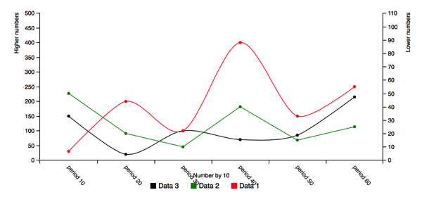
Notice the chart-axis-x-tick, this shows the cool feature to rotate the labels on the x-axis. Next up is adding a grid to the chart. You can configure to show the x and y grid. But you can also position one grid line on a specific value.
<br>
<chart-grid show-x="false" show-y="true"><br>
<chart-grid-optional axis-id="x" grid-value="1" grid-text="Start"/><br>
<chart-grid-optional axis-id="y" grid-value="20" grid-text="Minimum"/><br>
<chart-grid-optional axis-id="y" grid-value="200" grid-text="Maximum"/><br>
</chart-grid><br>
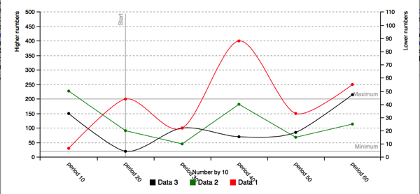
Another really cool feature is adding the subchart, with this you can select just a selection of the datapoints in the chart. Together with the zoom functionality this makes a very interactive chart. You have to try it to believe it.
<br> <c3chart bindto-id="chart5" show-labels="true" show-subchart="true" enable-zoom="true"><br> </c3chart><br>
Notice the attributes show-subchart and enable-zoom
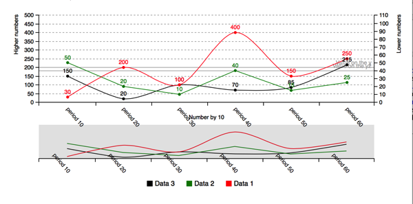
The last thing to show for now is putting the legenda at another location, changing the tooltip, change the size of the chart and provide an array of colors to use for the lines.
<br> <chart-legend show-legend="true" legend-position="right"/><br> <chart-colors color-pattern="#1f77b4,#ffbb78,#2ca02c,#ff7f0e"/><br> <chart-size chart-height="600" chart-width="600"/><br> <chart-tooltip show-tooltip="true" group-tooltip="false"/><br>
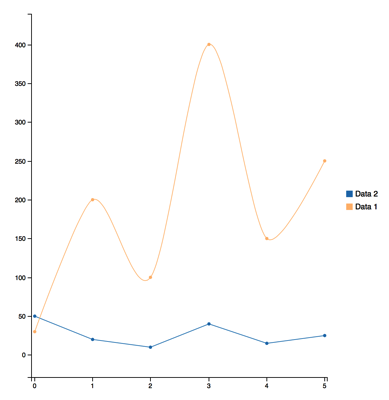
That is it for now, if you have ideas, improvements or bugs please use github (check code samples at references)
References
- Code samples – These are the code samples used in the blog.
- http://c3js.org – Homepage of c3.js, wrapper around D3
- http://d3js.org – Home page of D3.js, a very advanced charting library.
- Creating charts with C3.js – Blogpost by Roberto about c3.js
- Using C3js with AngularJS – Blogpost by me about angularjs and c3.js
- Directives for beginners (part I) – Blogpost by Dennis about angularjs directives
- Directives for beginners (part II)
