Creating charts with C3.js
![]() Everybody remembers that project where you need to display some data in a chart. When you select a library to create these charts you will obviously have a few requirements. One of the requirements will probably be that the charts must look good to impress your customer and if they don’t look the way you want, they must be at least be easy to style. But the most important requirement will be that the code to achieve your goal must be minimal and easy to understand. So one of the well known JavaScript library to create all kind of charts is D3.js. This library provided us the option to create a simple line chart with a tooltip that shows some data. So we thought that this would be a good fit for our project and started to create a chart. But wait… I see you thinking.. the title said C3.js and now you’re using D3.js?! Keep on reading to find out why!
Everybody remembers that project where you need to display some data in a chart. When you select a library to create these charts you will obviously have a few requirements. One of the requirements will probably be that the charts must look good to impress your customer and if they don’t look the way you want, they must be at least be easy to style. But the most important requirement will be that the code to achieve your goal must be minimal and easy to understand. So one of the well known JavaScript library to create all kind of charts is D3.js. This library provided us the option to create a simple line chart with a tooltip that shows some data. So we thought that this would be a good fit for our project and started to create a chart. But wait… I see you thinking.. the title said C3.js and now you’re using D3.js?! Keep on reading to find out why!
Line chart with tooltip
So my colleague (Jettro Coenradie) and I started to find some D3.js examples of a simple line chart with a tooltip and every time that we found one, we had a lot of code, didn’t really understand what happened and could get it working the way we wanted. So after half a day and a bad mood, Jettro started to create his own version of a line chart. Once finished we had a line chart with a tooltip in less code than all the examples we found so far. After that we needed an extra horizontal line in our chart and Jettro started to look for an example. At one point he told me to look at this library that he found.. He said: This looks really easy.. to easy to be true..
C3.js
So we found C3.js and tried to create the same chart with this library:
var chart = c3.generate({
  data: {
    columns: [ ['data1', 30, 200, 100, 400, 150, 250] ]
   }
});
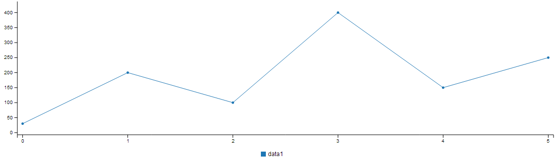 That was all code necessary to create our simple line chart with tooltip… We even got a legend and the option to temporary disable a line for free! Now let us try to create an extra horizontal line.
grid: {
  y: {
    lines: [{value: 150, text: 'My cool label at value 150'}]
  }
}
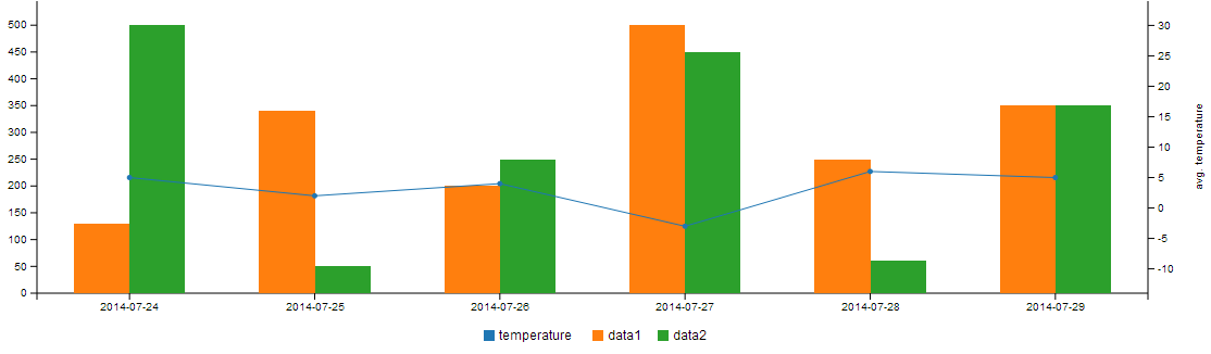
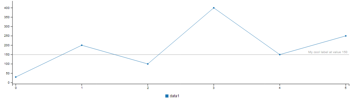 As you can see, that adding a extra line requires minimal code and is really understandable. We liked it a lot and of course continued the use of this library in our project. C3.js has a lot of examples on their website, but the documentation is not complete yet. Which was not really a problem for us, as everything we used was self explaining. I will show you a few more of the nice features that we have used in our project. We wanted to create a more advanced chart (a mix of a bar and line chart) with multiple axes. First lets take a look at the data in our chart. We have a column for the date, the temperature and two with actual data.
columns: [
  ['x', '2014-07-24', '2014-07-25', '2014-07-26', '2014-07-27', '2014-07-28', '2014-07-29'],
  ['temperature', 5, 2, 4, -3, 6, 5],
  ['data1', 130, 340, 200, 500, 250, 350],
  ['data2', 500, 50, 250, 450, 60, 350]
]
The default type of the chart must be a bar, but I want the temperature to be displayed as a line:
type: 'bar',
types: {
  temperature: 'line'
}
The temperature has a different scale than the two data columns. If we would keep them on the same y-axis the temperature line would barely be visible. Luckily it is really easy to add another axis:
axis: {
 x: {
   type: 'timeseries',
   tick: {
     format: '%Y-%m-%d'
   }
 },
 y2: {
   show: true,
   label: {
     text: 'avg. temperature',
     position: 'outer-middle'
   },
   max: 30,
   min: -10
 }
}
I have added a few more things now. First I tell the x-axis to be of the type ‘timeseries’ and apply a formatter. Next part in the code above is introducing y-axis ‘y2’. Add a label, the minimum and maximum value and we have a good fit for our temperature axis. All we need to do now is tell the chart to display the temperature on the ‘y2’-axis:
axes: {
  'temperature': 'y2'
}
 The data in our chart can become big, so big that it is not readable anymore. So we added two more nice features from C3. One is to be able to zoom and the other is to show a sub chart, which allows us to select a range of the chart.
subchart: {
  show: true
},
zoom: {
  enabled: true
}
Here is what the result looks like (note: the example might not work properly in this embedded view, go to the codepen site to see the example in full view): [codepen_embed height=”450″ theme_id=”1″ slug_hash=”AzvJq” default_tab=”result”][/codepen_embed] This library made the visualization of our data really easy for us. So next time I will definitely use this library if it will fit our needs. Make sure you check out the examples for some other great charts!