Windows Phone 8 – A new Platform
 I want to dedicate this blog to Windows Phone 8, a refreshing, exciting and relatively new mobile platform.
In the mobile world, I am mainly an iOS developer and I have “some” experience writing Android apps. I also have no development experience with any Microsoft platform whatsoever. So for me this platform is something completely different. It’s a new language, a different user interface mindset, a new SDK to learn…
So I decided to dive into it head first. I used Bootcamp to dual boot my Mac with Windows 8, I purchased a Windows Phone developer subscription, installed Visual Studio and I bought a second hand Nokia Lumia 920. I want to give you my first impressions and give you a general overview of what Windows Phone 8 is and what it will be like to develop apps for it!
What’s so interesting about it?
Although I like iOS very much, it’s sometimes interesting to look at other platforms to make sure I’m not missing out on anything. I tried Android before but in the end I didn’t like it very much. Windows Phone on the other hand, looks very promising and is very original. Also, learning a new language and platform is always fun.
Content over chrome
 At first glance, Windows Phone 8 looks totally different from what you’re used to with other kinds of smart phones. It applies the “content over chrome” principle, which means that they don’t spoil the UI with things that don’t have anything to do with content. In other words, Windows Phone doesn’t do skeuomorphism. So UI’s are mainly built out of abstract lines and text. The beauty of this is that Microsoft was really thinking out-of-the-box this time! They didn’t try to steal anything from any other platform and came up with something completely different on their own. In my opinion they did a very good job. The UI looks clean, intuitive and very original!
Controlled platform
Furthermore I like the fact that, like iOS, Windows Phone 8 is a controlled platform. Many people view this as a negative aspect, but for example iOS couldn’t have been as good as it is today without all the restrictions. Without restrictions you’ll get chaos like what’s happening on the Android platform: endless number of devices you have to support separately, endless number of OS versions you need to support. Also when a user downloads an app you can’t be sure if the app even works on your device, often the user can’t even upgrade the device to the latest version of the OS, and the platform is very vulnerable to all kinds of malware. And the list goes on… With Windows Phone 8 you only have to support 3 screen sizes, apps are reviewed by Microsoft, and when you download an app there is no doubt that it will run on your device. Also there are some rules specifying what an app can and cannot do so an app won’t record your phone conversations without you ever finding out for example.
Promising market share
And finally there is the market share. At this moment the market share is very small, but apparently it’s growing! I constantly read positive things when I come across articles concerning Windows Phone 8.
April 6th 2013
Windows Phone U.S. market share growth outpaces Android
May 3rd 2013
Microsoft Says Windows Phone 8 App Downloads Have Doubled And Revenue Up 140%
June 3rd 2013
Kantar: Windows Phone still growing in the US, now has 5.6 percent share
July 10th 2013
Russia’s largest carrier backs Windows Phone after ditching iPhone
Totally different UI
Windows Phone 8’s UI is totally content driven, which is the opposite of what I’m used to. iOS 7 is also going in that direction with it’s “flat design”, but Windows Phone 8 is still a bit more extreme that way. After playing around with the new interface for a while, I found that it looks and feels really well. It has smooth animations, it’s very responsive and very intuitive. Below are a list of things that stand out most.
Big fonts
The first thing you will notice when looking at some Windows Phone 8 apps, is that they use very big fonts for the titles of the pages. It looks really good and really defines their own style. Although I think that these titles sometimes waste too much valuable space. But it didn’t seem to bother me at all so I think they got away with it 🙂
Focus on content
Like I said before, the focus of apps really lies on the content. So most of the time the screen is filled with text and not much more. This means that you won’t see many nice borders, shadows, gradients and such. Also the yet to be released iOS 7 on the iPhone doesn’t use those things anymore either. Why? Well let’s go back to 2007, when the first iPhone was introduced. We were not very familiar with the concept of interacting with applications this way. It needed to represent the real world, to make the user interface as intuitive as possible. If you for example see something that looks like a button, you immediately know it’s something you can tap on. Nowadays most people are very used to the concept of smart phones and what they can do. We don’t need all the familiar things anymore and we can really focus on the only stuff that matters in apps: the content.
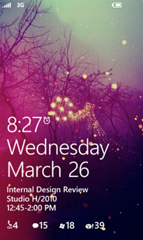
Lock screen
Nothing very exciting is happening here. You have to slide to unlock it, in a vertically upward direction. The lock screen has a wallpaper and it displays the date and time. But the cool thing is, apps have the ability to customize the lock screen! Apps can display some information on the bottom, like new messages or upcoming events. Apps can even be the provider for the background image of the lock screen!
Hardware buttons
Like Android, Windows Phone has hardware buttons. I’m not sure I like this part. On one hand I like the fact that iPhone only has 2 hardware buttons (aside from the volume buttons). One that turns off the display and one to bring you back to the home screen. It is elegant and simple. On the other hand, it is very handy to have a few more buttons for stuff you use regularly:
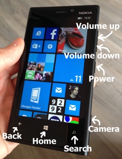
Back button: on Windows Phone this doesn’t only bring you back a page within one app, but also can bring you back to the previous app. It behaves pretty much like your browser’s back button. Having this button has the advantage that apps don’t have to put a back button on the screen for every page.
Home button: this one is just like on iPhone: it always brings you back to the home screen
Search button: this activates Bing to search the web
Power button: switches the display on and off (and turns the phone on and off when long pressing it)
Camera button: Quickly lets you shoot a picture by opening up the camera app instantly.
And of course it also has the volume buttons
Multitasking
You could tap the back button to go back to where you were, but if you really want to scan all the pages and apps you opened previously, you press and hold the back button. A screen pops up with all the screens you previously went to. It’s very similar to what iOS 7 just introduced.
The main difference is that on Windows Phone 8, you see all the separate screens. On iOS 7 you see only all the apps you previously used.
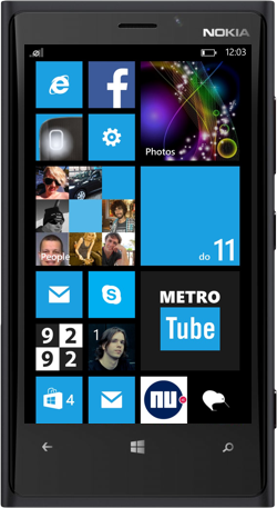
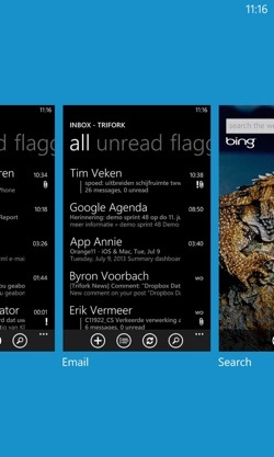
Live Tiles
The home screen contains many squares and rectangles called Live Tiles. They are the perfect combination of dull iOS icons and interactive Android gadgets. Each tile displays information available within that app, and often animates as well. Seeing all the tiles animate at once gives you really the feeling of a home screen that is “alive” and is actually giving you useful information without having to open a single app.
It’s also very personal. You can take one look at a person’s Windows Phone home screen and you can already see some personal details about that person. You see a picture of him, you see some pictures of his Facebook friends, you see the appointments that person has today, you see some photos he took on his phone… and so on.
There are three different types of tiles:
- Flip – A tile which basically has two sides (one with text and one with an image) that flips over every now and then.
- Iconic – Displays a static icon for the app, optionally displaying some information. This type of tile does not animate.
- Cycle – Cycles through up to 9 images, animated.
All tiles can be displayed in three different sizes: square, bigger square and a large rectangle spanning the entire width of the screen. It’s up to the user which one to display at any given moment.
Pick the apps you want to see on the home screen
This is a great feature actually! On iPhone, all installed apps are on the home screen. This can become very messy. On iPhone they tried to solve this with folders, which is kind of nice but still messy. Most people have 30 to 50 apps installed but they only use like 8 of them regularly. You only want the apps you use most to be quickly accessible. On Windows Phone you can do just that! The home screen only contains the apps you chose to be there. For all the other apps: swipe to the left to see a list of all the apps you have installed. Press and hold an app in this list to pin it to the home screen.
Themes
On Windows Phone 8 a user can choose between a white or a black background and he can choose between a bunch of colours to use as the accent colour. The accent colour is used to highlight some parts of the UI, and it also defines the colours of the tiles in your home screen. Most apps adapt their look to those colours. It is very easy to implement in the app because all native components already respect the theme colours. Although it is recommended that apps do this, you are still allowed to ignore it and implement your own style.
Status bar
On iPhone the status bar is always there and it reserves 40 pixels of height all the time. Why is it always there? Would you miss it if it was gone? Well in fact you would miss it, because you wouldn’t be able to keep track of the battery status and the time. Those are basically the only things you most need the status bar for.
On Windows Phone 8, the status bar automatically hides, which leaves more space for the app. But when the status bar hides, it still displays the battery status and the time in the top right corner! You can bring it up the rest of the status bar by double tapping the top of the screen which brings the other information back for a few seconds.
The advantage of this is obviously that apps can always use the entire display, without having to sacrifice space for the status bar.
Similarities with iOS
Although the UI of Windows Phone 8 is completely different from iOS, there are also some similarities with iOS that have more to do with the controlled nature of the platform.
Review procedure
Windows Phone 8 knows a review procedure just like on iOS. This way you will (almost) never find apps in the store that do malicious things and apps will always work as advertised.
Multitasking
They implemented multitasking in a similar way as Apple, meaning that apps are essentially killed when they are not active (on screen), and restored when the user switches back to the app. Also Windows Phone 8 apps are allowed to do certain tasks in the background, just like on iOS (e.g. VOIP and location tracking). On Android they think the mobile platform is nothing more than a small desktop computer, leaving all apps running in the background, draining the battery intensively.
Actually, Windows Phone 8 took this concept one step further than iOS. It introduced the notion of “tomb stoning”. When an app is inactive it gets tomb stoned before it is completely killed. Tomb stoning means that the memory footprint is drastically reduced by unloading everything the app loaded, while still keeping the app alive. The downside to this is that you as a developer now suddenly need to implement code that loads everything back into memory when a tombstoned app is pulled back to the foreground. The advantage is that a tombstoned app loads more quickly and brings you back where you left off instead of starting the whole app again.
Buttery smooth animations
On Windows Phone 8, apps value animations just as much as apps on iOS do. They make the user experience so much better. And they’re buttery smooth too! Also the live tiles home screen is full of animations. That’s why looking at screenshots of Windows Phone 8 is not enough to get a full impression, you really have to see all the animations that are going on across all of the screens.
Limited number of screen resolutions to support
When you’re developing an app for Windows Phone 8 you only have to support three screen resolutions, very similar to iOS.
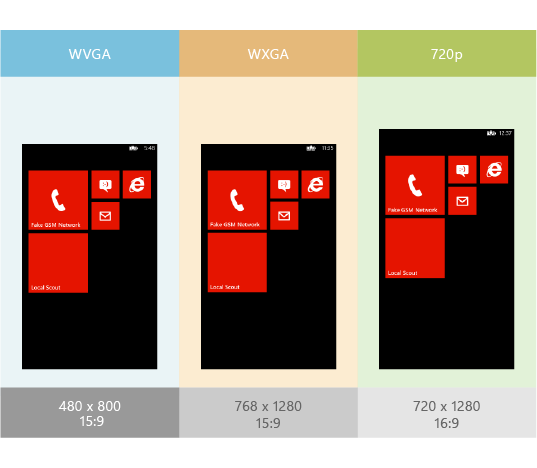
- WVGA: 800×480 (15:9)
- WXGA: 1280×768 (15:9)
- 720p: 1280×720 (16:9)
(click on the image to enlarge)
In fact, you mainly have to program against one resolution: 800×480. It will automatically be translated to the 1280×768 resolution (which is also a 15:9 aspect ratio). The only thing is that this uses a scale factor of 1.6, while on iOS the scale factor is 2.0 (Retina). The advantage of 2.0 is that all pixels are doubled, leaving no blurry pixels. Using an 1.6 scale factor, you might not be able to create a pixel perfect UI on 1280×768 when programming against 800×480.
What about the 720p resolution? This resolution has a slightly different aspect ratio: 16:9. This means you have to take into account that the height may be different on the target device. You will get 53 extra pixels to work with in this case. So you will program against an 853×480 resolution. This is very similar to iPhone 5, which has 88 more pixels to work with. This is no big deal because most apps have scrollable content in the middle anyway, which is very easy to scale vertically.
So basically, if you want your app to work perfectly on every device, you will only need to test it on three different devices. As opposed to doing the same for an Android app, which requires you to buy approximately 150 devices.
The App Store
Of course Windows Phone also has a store for apps. I’m not sure they’re allowed to call it “app store” but I like to call it that because that way everyone will know what I’m talking about.
Trial mode
I like the fact that you have a trial mode for most apps in the Windows Phone 8 app store. This is very useful if you are not sure this app fits your needs and screenshots alone are not enough. As a developer you have to implement support for the trial mode inside your app. That way the user can download your paid app for free, but running in a limited way. Apps in trial mode don’t expire so you can use them as long as you like.
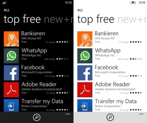
Not a lot of apps (yet)
Although the amount of available Windows Phone 8 apps are growing at a very fast rate, you will notice that some apps you use regularly are still missing. Luckily most of the apps are there: Spotify, Skype, 9292 (dutch public transport app), Rabobank, ING, ABN (dutch banking apps), Facebook, Twitter, Nu.nl (dutch news), What’s app, Shazam. But some apps are still missing.
- No official YouTube app, there are some third party apps but none of them are that great.
- No DropBox app.
- Nokia Maps are installed by default on my Nokia Lumia 920 but it is really crappy. No good Google Maps app exists yet either.
- No good calendar app. The native app is a hassle to work with.
- No good e-mail app like MailBox but the native app is doable.
But I think those gaps will be filled in no-time, for example Path, Flipboard and Hipstamatic were recently announced to come to Windows Phone. So I have confidence it will be alright.
Conclusion
Although Windows Phone 8 looks and feels really refreshing and new, in my opinion the platform isn’t mature enough yet. This is the main reason I wouldn’t use it right now instead of my iPhone. And of course because of some Apple-ecosystem features I wouldn’t want to miss out on: iCloud backups, Airplay, Airprint, iMessage, synchronised notes and stuff like that (via iCloud), iCloud tabs and so on…
But, Windows Phone 8 looks very promising and most of all I find it very exciting to learn how the UI works, to find out how to create apps for it and to learn about all the different components. To be continued in a next blog!