WWDC 2015: Auto Layout improvements
Last weekend I arrived home safe and sound, already missing San Francisco. I had a wonderful time there and I have lots to talk about, but there was one topic in particular I think was not highlighted enough. That’s why I want to discuss it here. It was discussed in the following talks during WWDC:
Mysteries of Auto Layout – part 1
Mysteries of Auto Layout – part 2
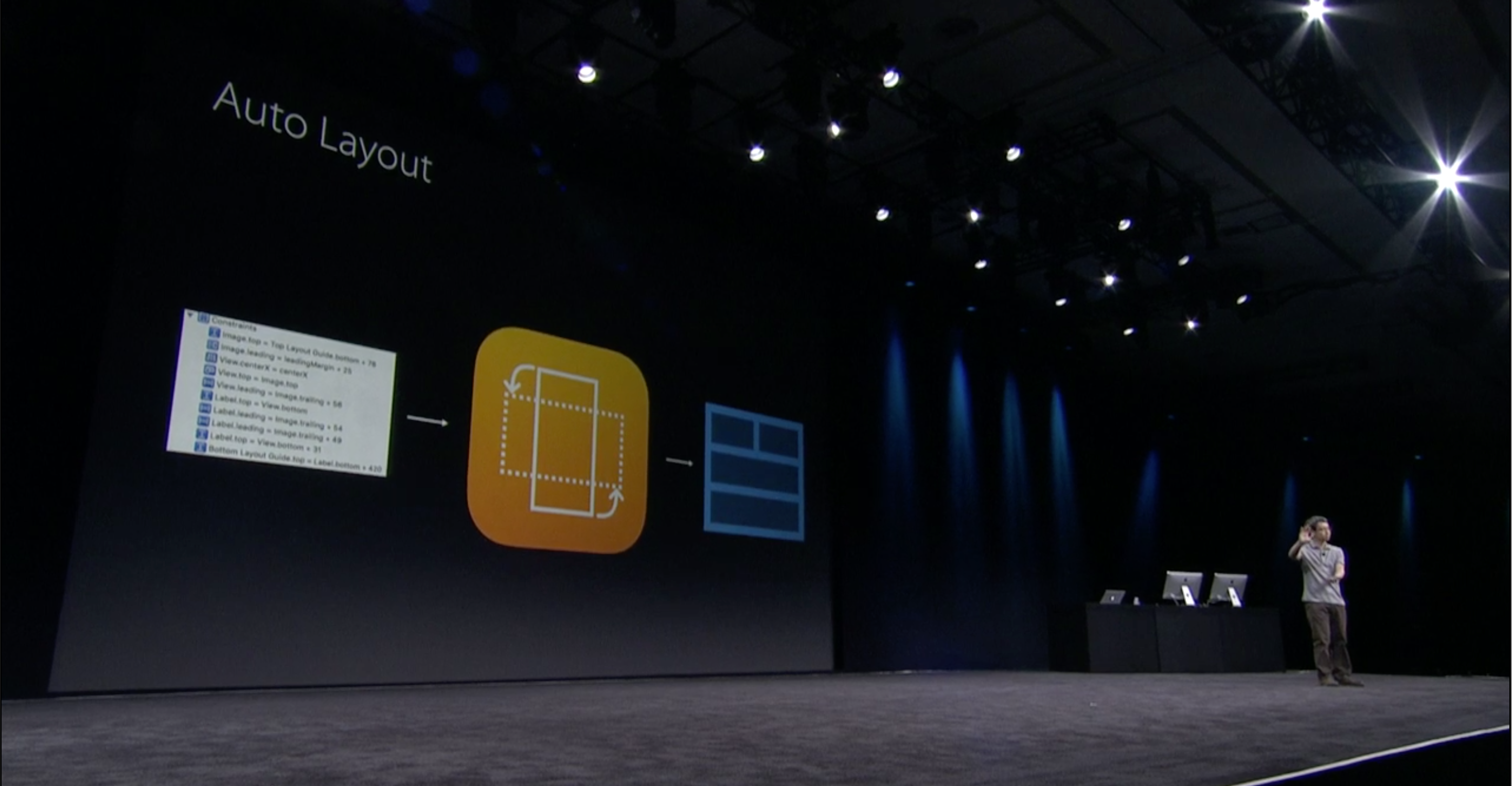
I am a big fan of auto layout since it was introduced in iOS 6 and especially by using it directly in code, not by using Storyboard. But when using it in code it can get really verbose. I wrote some classes around that to make the resulting code much more compact. I wasn’t happy with my solution. So I was planning to go to a Lab during WWDC, to ask an actual Apple auto-layout engineer for his opinion about this matter. But it turned out I didn’t have to! Apple solved most of the problems I was having with Auto Layout with new API’s in iOS 9! In this blog I want to highlight those new API’s which make it easier to work with Auto Layout both in code and in Storyboard!
What is Auto Layout?
For those of you who are new to Auto Layout I want to quickly go over what it actually is. Auto Layout is basically a mechanism to make it easy to support different screen sizes in a declarative way.
The core of Auto Layout is extremely simple. It uses ‘constraints’ to determine the x, y, width and height properties of the views on screen. A constraint is basically a rule describing a certain aspect of positioning and sizing a view. A view needs multiple constraints to be positioned and sized correctly. A constraint is represented by the NSLayoutConstraint class and simply follows this formula:
view1.attribute1 = view2.attribute2 x A + B
This is the core of Auto Layout, and all constraints follow this pattern. With a set of constraints following this formula you can layout anything and it will scale properly on the different screen sizes.
For example:
label.Top = container.Top x 1 + 20 (lays out a label’s y-value to be 20 points below the top edge of the container view)
label.Width = container.Width x 0.5 + 0 (sets the width of a label to always be half of the container’s width)
Why use Auto Layout?
Once upon a time, it seemed like iOS apps did never have to scale in screen size. You just had the iPhone 3G, 4 and 4S to support which basically all had a resolution of 320×480. With the introduction of Retina screens that did not change, because as a developer you could still pretend the screen was 320×480 while the system would translate that to 640×960. You also had the iPad, but you didn’t have to scale for that one, because you would design a specific user interface for iPad anyway, which would be specific for its screen resolution of 1024×768.
Supporting different resolutions
With iPhone 4S came iOS 6.0, which introduced auto layout. We didn’t feel the need to use it yet, but in a year its purpose became clear: to make it easy to support bigger iPhone screens! At that moment the only real benefit came from rotating the screen from portrait into landscape, which effectively also is a resolution change.

iPad multitasking
Along with iOS 9 now comes another reason why Auto Layout is important on iPad: multitasking! You can now view two apps at the same time side by side, which means apps will need to be able to size themselves to be quarter screen wide, half of the screen or full screen. The user decides how big each app is displayed. With Auto Layout you can adjust to these changes fairly easily.
Stacking views
Before iOS 9, we had to add many different constraints to all different views within a single screen to position them correctly and let them handle screen size changes accordingly. This was easy, but a little hard to manage. There were two ways to do it:
- Using storyboard
- In code
Storyboard
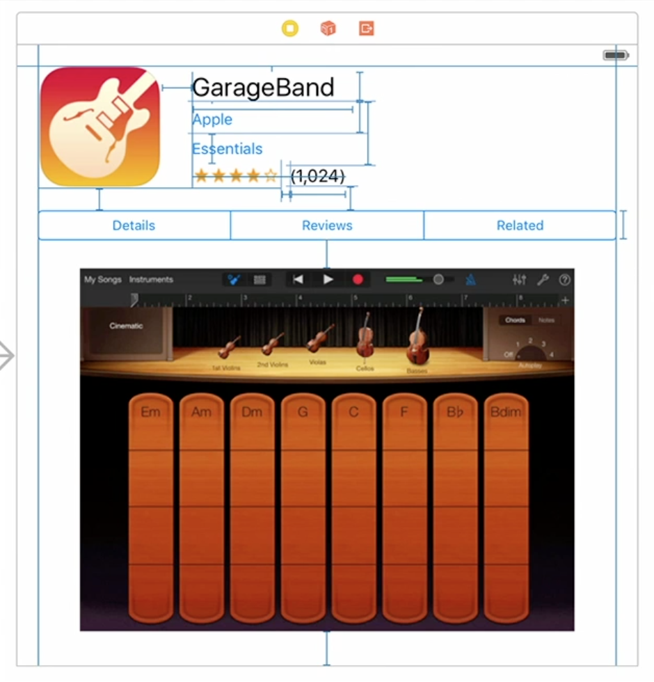
Using Storyboard you can click and drag to create constraints and you end up with lots of blue lines, which represent the constraints. Now you want to insert another label, right in between “Garage Band” and “Apple”. What do you do? You remove some constraints connecting those existing labels, you insert your new label and you connect the existing two labels to your new label. This demonstrates how hard it is to maintain constraints this way.
Constraints in code
In code you basically have the same problem and instead of blue lines you have code like this:
view.addConstraints(NSLayoutConstraint.constraintsWithVisualFormat("V:|[titleLabel]-padding-[descriptionLabel]-padding-[imageView]", options: nil, metrics: [
                "padding": 10
            ], views: [
                "titleLabel": titleLabel,
                "descriptionLabel": descriptionLabel,
                "imageView": imageView
            ]))

view.addConstraint(NSLayoutConstraint(
         item: titleLabel,
    attribute: .Leading,
    relatedBy: .Equal,
       toItem: self,
    attribute: .Leading,
   multiplier: 1,
     constant: 10)
)
Again, not the best solution for easy maintenance.
UIStackView
With iOS 9, there is a new UI component that comes to the rescue, the UIStackView! You can put an array of subviews into this UIStackView, and it will stack them vertically or horizontally with almost no effort. No need to add all those constraints attaching each subview to the sides of the parent view and chaining them all together. This is all done for you by the UIStackView.
In the example above you just have to identify where you can apply the stack view. You need to find places where views are stacked on top of each other. Almost every UI you can think of you can build out of nested stack views. Apple recommends using stack views for every layout and only use separate constraints when you really can’t do it with stack views.
Example of how to use the UIStackView:
let stackView = UIStackView(arrangedSubviews: [titleLabel, descriptionLabel, imageView])
stackView.distribution = .Fill
stackView.alignment = .Leading
stackView.axis = .Vertical
stackView.spacing = 10
That’s it! Adding a label in between the titleLabel and descriptionLabel for example now is as easy as simply adding it to that array of ‘arrangedSubviews’!
One added bonus: you can easily animate hiding/showing views by simply animating the hidden property of a UIView, which normally is not an animatable property.

So all that’s needed is animate the hidden property, like this:
UIView.animateWithDuration(0.5, animations: {
    someSubview.hidden = true
})
My own re-implementation of UIStackView
How wonderful the UIStackView may be, it is only available from iOS 9 and up! But I want to use it right now in my apps which still have to support iOS 7 and/or iOS 8. The API of UIStackView looked simple enough: you initialize it with an array of views and you configure it a little using ‘distribution’, ‘alignment’ and ‘axis’. That’s basically it! I thought: how hard can it be? Well it turned out to be more work than I anticipated, but I did it! I rewrote this entire thing to make it work in iOS 7 and iOS 8. I am proud to present: the TZStackView!
https://github.com/tomvanzummeren/TZStackView
I designed it so it has exactly the same API and therefore can be drop-in replaced by the real UIStackView later on. So to repeat the above UIStackView example with my TZStackView implementation:
let stackView = TZStackView(arrangedSubviews: [titleLabel, descriptionLabel, imageView])
stackView.distribution = .Fill
stackView.alignment = .Leading
stackView.axis = .Vertical
stackView.spacing = 10
Layout guides
Another new concept of Auto Layout in iOS 9 is the ‘layout guide’. It is to ‘constrain negative space’. What do I mean by that? To explain that, let me give you an example situation:
You have three boxes with a static width that need to fill the available space, so you want the spacing in between those rectangles to be equal.
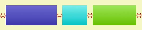
The empty space in between the boxes is called ‘negative space’ and you want to express using constraints that you want those spaces to be equal to one another. Long story short: you can’t express that directly because constraints can only be applied on views, not on margins between those views. Before iOS 9 what you could do is add 4 transparent subviews in between those boxes, also known as ‘spacer views’ and put constraints on those. That works like a charm!
The problem with this approach is that it’s kind of a hack. You pollute your view hierarchy with things that are just there to position other views with no purpose of their own. This also impacts performance.
This brings me to layout guides, represented by the UILayoutGuide class. You can add them to your view like this:
let layoutGuide = UILayoutGuide()
view.addLayoutGuide(layoutGuide)
Next, you can use the layout guide in your constraints, just as you would do using ‘spacer views’.
view.addConstraint(NSLayoutConstraint(
         item: layoutGuide1,
    attribute: .Width,
    relatedBy: .Equal,
       toItem: layoutGuide2,
    attribute: .Width,
   multiplier: 1,
     constant: 0)
)
The benefit now is that we don’t pollute our view hierarchy and replaced our spacer views with much more light weight ‘layout guides’. They cannot respond to touches or present themselves visually on screen. They are just there to apply constraints on, to help laying out other views that DO have a visual appearance.
Constraints fluent interface
This is also a feature I want to back-port in the near future. They silently added it and it was shortly mentioned in two presentations I saw at WWDC. They simplified the way you can create single constraints. I’ll repeat an example I gave earlier in this blog:
view.addConstraint(NSLayoutConstraint(
         item: titleLabel,
    attribute: .Leading,
    relatedBy: .Equal,
       toItem: self,
    attribute: .Leading,
   multiplier: 1,
     constant: 10)
)
Now you can write this code instead, which has the exact same effect:
view.leadingAnchor.constraintEqualToAnchor(titleLabel.leadingAnchor, constant: 10)
I was very happy when I first saw this new way of writing constraints! Much more readable, easier to remember and more maintainable. This together with the UIStackView will greatly reduce the amount of Auto Layout code I have to write in the future! As I said I am going to make a iOS 7 & iOS 8 compatible version for this as well!
Right-to-left language support
Right-to-left language support is here! I didn’t know this was something that was missing, but apparently people who use right-to-left languages like Arabic expect user interfaces to be aligned to the right instead of to the left as well.

The way it’s implemented is really simple. They simply used the ‘Leading’ and ‘Trailing’ layout attributes as an abstraction over ‘Left’ and ‘Right. Before iOS 9 the ‘Leading’ and ‘Trailing’ layout attributes already existed, but they were equivalent to Left and Right. Not anymore! In fact, Apple recommends using Leading and Trailing anywhere you would normally use Left and Right. This way your app supports the layout for right-to-left languages out-of-the-box!
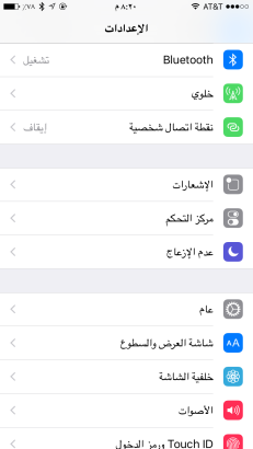
Next to supporting it for third party developers, they also adjusted the entire OS to support right-to-left languages! Even the standard transitions to new screens are flipped (new screen coming in from the left). It looks really weird, but it probably looked weird before this change to left-to-right language people.
To summarize
Many improvements have been made to Auto Layout I am very happy with. To summarize:
- stack view
- layout guides
- layout anchors (fluent interface)
- right-to-left language support
I recommend you to go see Mysteries of Auto Layout – part 1. To learn about how to debug auto layout problems better, watch Mysteries of Auto Layout – part 2 in which all these new things are explained in more detail. To learn everything about right-to-left language support, watch New UIKit Support for International User Interfaces.